Think back to a time when you were scrolling through your Facebook feed, and an ad grabbed your attention, so good that you stopped scrolling and HAD to click on it. This is exactly what you want people to do when they see your brand’s Facebook ads. However, how do we do that?
A person is exposed to 5000 ads per day on average. And 6 million advertisers are vying for their attention. While running ads might be easy, at times even the most vetted marketers struggle to ideate designs that convert.
How to Make Facebook Ads That Convert
There is a lot to be taken into consideration. From understanding the audience’s buying stage, selecting the ad images, sizes, fonts, color palettes, drafting value-driven and quirky ad copy, and choosing the right Facebook ad format to ensure that the ad fits the bigger idea.
There is no denying that eye-catchy ad designs evoke strong emotion. But we live in a virtual world that’s getting noisier each day.

So what are the elements that make an ad worthy of a click? We have lined up a list of best practices (with examples) to design ads that convert like hotcakes.
1. Plan for ad placement before designing
Three main places where you can display a Facebook ad are the desktop feed, mobile feed, and the right column. Each place has a distinct size. It could be easier to design one ad and resize it to fit across all areas. However, that’s a bad idea. You might harm your ad’s performance if you ignore the specifics of ad placement.
Understand your target audience first. Are they desktop or mobile users? Do they like using the marketplace or stories? Once you get a hold of that, you can design accordingly. Planning like this will streamline your advertising, and yield better ROI on your ad spend.
Facebook recommends “Automatic Placements” where they figure out the ad placement for you. But you need to provide designs for all placements.
2. Choose the right Facebook ad format
Currently, Facebook has 8 primary ad formats. Before diving into the waters of how your ad will look, determining your ad format is a must.
1. Single image Ad: Image ads fit in perfectly at any stage of the funnel. Before designing make sure your ad has a proper aspect ratio, the image quality is high, and your value proposition is crystal clear.
2. Video Ad: Video ads deliver high engagement as they connect better. Facebook suggests your video ads should be 15 seconds or less. Nowadays, making video ads is easier thanks to free video effects like the ones offered by Videvo.
3. Slideshow Ad: When you combine a bunch of images (3-10) in a video format, that’s called a slideshow ad. These ads consume 5x less data as compared to traditional videos.
4. Stories Ad: They provide a lot of creative freedom as compared to other Facebook ad formats and are perfect for establishing a deep connection.
Quick pointers: Keep the pace of the stories smooth with great transitions, introduce AR/VR to your stories, and most importantly optimize your images and videos for a full-screen viewing experience.
5. Instant Experience Ad: These are mobile-only ads that open once someone taps on an ad. They help in capturing attention, telling a story about the brand, and letting you add more content to the ad.
6. Carousel Ad: Carousel ads are excellent to promote a bunch of products, showcase property, educate about the services you offer, present event details or job openings, and much more.
7. Collection Ad: This ad format includes a cover image/video that has four product images beneath it. It’s like a window-shopping experience where the audience can explore your lineup of products, all with one tap.
8. Messenger Ad: You can widen your brand’s reach by running ads in the Messenger inbox. Facebook automatically delivers ads to the placement that will drive results as inexpensively as possible.
Before you begin the design process, evaluate which of these ad formats can be leveraged to maximize the results of your ads and check out more details about these specific formats in our guide on running facebook ads.
3. Let your brand identity shine through
With each Facebook ad that you create, you are setting a tone for your brand’s identity. So, make sure your ad design includes the basics like logo, color scheme, selected fonts, and key products/services.

Having a brand identity is crucial to make sure that your advertising designs elicit the kind of emotion you want your audience to feel. For example, McDonald’s official colors are yellow, red, and black. Here’s how a typical ad by them looks.
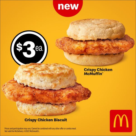
Source: Facebook Ad Library/McDonald’s
4. Define your Facebook ad’s objective first, design then
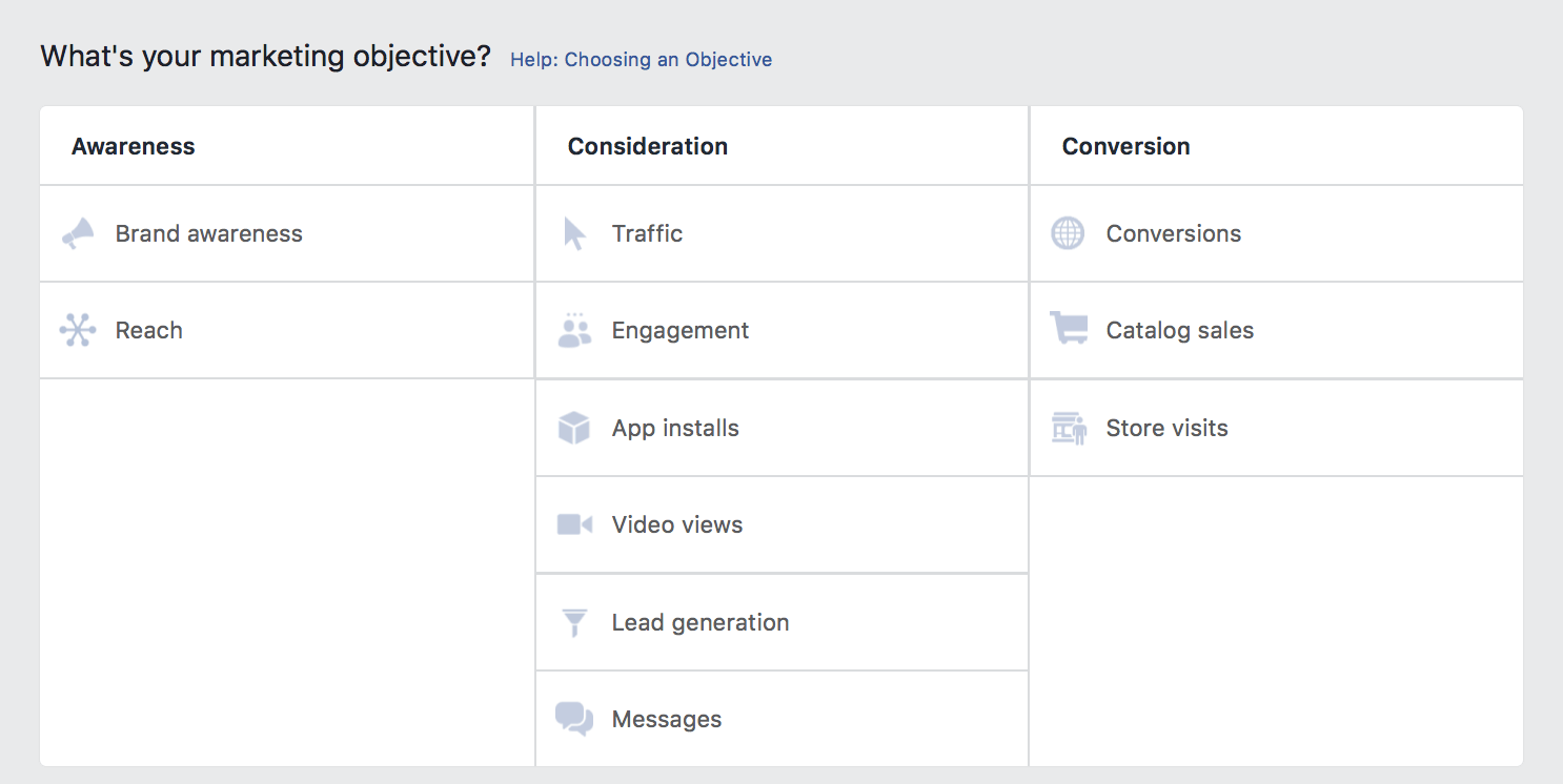
It’s known that your Facebook ad should be designed with a goal in mind.
However, it is also critical to ensure that your ad design matches your ‘Facebook Ad campaign objective’. Are you creating an ad for the awareness, consideration, or conversion phase? Best Facebook ads are always optimized for their campaign objective.
After you are sure about that, you can create your designs accordingly.
5. Be humble, keep it real and simple. Less text and more visual
3 seconds. That’s the amount of time you have to grab people’s attention while they are scrolling on Facebook. It is imperative to be direct and clear about your value proposition, with minimal words. According to a study, images with less than 20% text work better.
Another crucial point is to focus on a single emotion or rather a single message. If you try to juxtapose multiple offers in one ad, it’ll get all cramped up. It will overwhelm your potential customer, and they might just pass by.
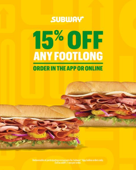
Source: Facebook Ad Library/Subway
If there’s additional information you wish them to know, save that for the page they will be directed to once they click on the CTA.
Ad copy is another essential element of an ad design and plays an integral role in how well the ad converts.
6. Add some attention-grabbing contrast
If you want your ads to be seen, make use of tested visual techniques. Attract attention with contrast. A fundamental contrast technique is to use two distinct colors on the color wheel. Opposing colors intrinsically bring out the best and help enhance the visibility of the text and image.

- Don’t use the Facebook blue, or else your ad design might blend in too much to be noticed
- Create a colored border around the ad image, as it makes your ad grab more attention
- Adding a white background (using a background changer) to your ad can be a good key differentiator in the feed
9. Design for niche audiences
There is no denying that Facebook is a full-fledged database of people’s likes, dislikes, locations, jobs, and much more; which offers a stellar opportunity to craft advertising experiences that attracts a typical set of audiences.
So, make sure to take full advantage of microtargeting. Wondering how? Let’s look at this example by Reddit.
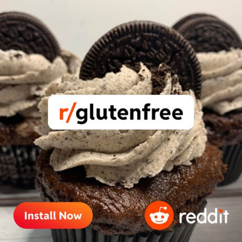
Source: Facebook Ad Library/Reddit
The ad caters to a specific type of audience i.e. people who take a gluten-free diet. Through this ad, Reddit is trying to divert health-conscious people to their r/glutenfree subreddit. The imagery makes it all the more interesting. There is a stigma attached to the fact that a gluten-free diet is bland. But by showing a cupcake in the design, Reddit is trying to convey the exact opposite.
A gluten-free diet can be delicious, indeed. Who doesn’t love a gluten-free chocolate cupcake with an appetizing frosting?
Wix targeting musicians is another great example of microtargeting.
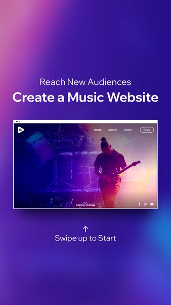
Source: Facebook Ad Library/Wix
Microtargeting helps you curb ad fatigue too. Ad fatigue is when your ads are shown to your audiences so often that they lose interest in your brand. Optimize your ad designs for niche audiences, and connect better. That way not everyone has to see your ad.
10. Steer clear from bad quality images
Images are an essential component of storytelling. They build credibility.
65% of people are visual learners. And this explains why ad creatives are the largest driver of sales, standing at a whopping 47%. So: yes, choosing the right ad images CAN NOT be overlooked.
Facebook has a checklist of the best practices that you can refer to. Here are a few more.
No abstract concepts: Pick images or designs relevant to your service/product that help enhance the message you wish to convey.
Purchase stock photos: Original graphics and illustrations make a design stand out. But if you are low on budget or time and can’t afford professional photos and models, then high-quality stock photos are the way to go. Unsplash is a popular platform for stock photos.

Source: Facebook Ad Library/Kaiser Permanente Thrive
Experiment: Sometimes good typography, contrasting colors, and a minimal copy can be enough. For example, this ad by The New York Times has a feel-good minimal design, and the play with the colors is quite well executed.
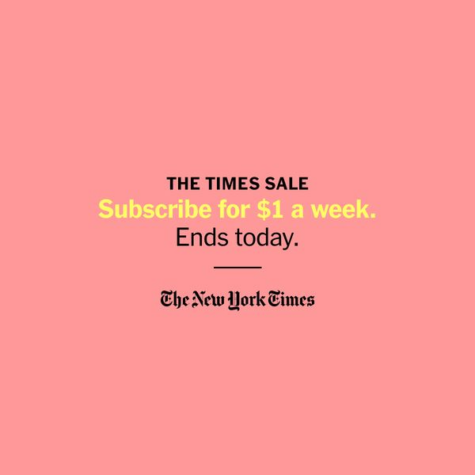
Source: Facebook Ad Library/The New York Times
11. Human faces build trust
Humans feel more connected to designs that have faces. They induce a sense of warmth and emotion into your design. According to studies, 91.7% of ads that feature a person’s face attract more attention than non-face ads. Studies also show that the brain is biologically hard-wired to process faces.
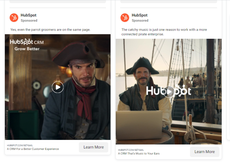
Source: Facebook Ad Library/Hubspot
12. Use fonts that are easy on the eyes
Typography is an essential element of a brand’s style guide. Since 40% of sessions on a phone are microsessions, therefore your ad design should have user-friendly fonts.
- When the font is easy on the eyes, it becomes effortless to read. Flashy fonts might garner some attention, but can divert the viewer from the core message.
- If you are overlaying the text on the visuals, the legibility of the font must be factored in too. Legibility is the measure of how easily two letters can be distinguished from each other. Since it is greatly influenced by conditioning (i.e. the more times you see a font, the more legible it is for you), it is safe to pick fonts that are widely used. Popular fonts like Sans Serif are a good pick.
- Lastly, stick to two fonts per design, because more fonts can mean more distraction.
13. Sync your landing page with the ad
Transparent and recognizable branding helps build trust and awareness. Make sure your brand identity is uniform across all marketing platforms – be it the logo, color scheme, or fonts. For example, SHIFT a digital marketing agency witnessed a 23% increase in engagement when they synced their Facebook ad design with their landing page.
14. Ideate for stories and mobile-first designs
2 billion, that is 51% of total mobile users today access the internet through their smartphones. It is predicted that this number will skyrocket to 72.5% by 2025. If you want your users to have a great experience, plan for mobile-first or stories-first designs.
58% of people who were surveyed said they got more interested in a brand/product after seeing it in Stories.
- Full-screen vertical designs are engaging: Stories are all about sharing and expressing moments in real-time. Ad designs that are vertical and full-screen forge a sense of community and can feel more engaging.
- Mobile-shot stories outperform by 63%: When compared to studio-shot ads, mobile-shot stories performed well when it comes to getting app installs, and making purchasing decisions. Advertisers can push direct responses by incorporating native story behavior like ‘swipe up’, ‘tap and hold to pause’. They can add compelling offers to optimize further.
15. Design for accessibility and inclusion
1 billion+ people across the world live with some kind of disability. If you are not considering accessibility while designing ads, then you might be sidelining the needs of a good chunk of the population. To make your designs more accessible use alt-test, subtitles, and colors that have a high degree of contrast. Designs that are not easy on the eyes can hinder the visual experience.
16. Design for the laughs
It’s known that humor in advertising is a tried and tested strategy. Humor causes people to watch, laugh, and remember. However, ideating and designing ads on the lines of humor is like walking on thin ice because humor is personal. A single idea has the potential to cause both laughter and disgust. If an ad genuinely makes consumers laugh, it can end up creating a more meaningful relationship between the brand and its target audience.
Old Spice has been leveraging humor in their ads, and they will for sure tickle your funny bones too!
17. Embed social proof
Social proof helps in establishing trust, authority and creates a bandwagon effect. In the context of advertising, it is a piece of solid evidence that other people have used/purchased a product/service and found it valuable. Social proof is a sure-shot way to increase conversions.
Examples of social proof are customer testimonials, customer lists, product reviews, or even quantifiable data (Ex: 2 million downloads). In this below example, Grin, a software company, is advertising a customer testimonial.
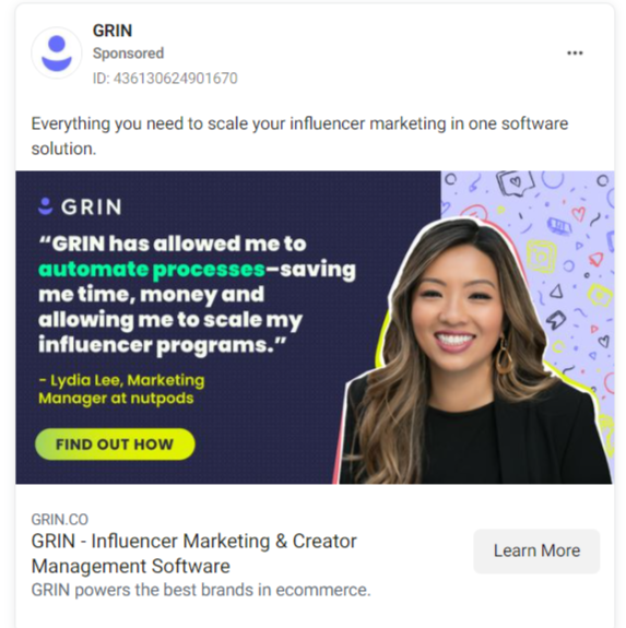
Source: Facebook Ad Library/Grin
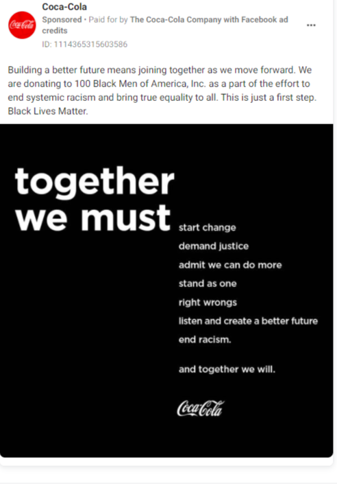
18. Design for social causes
In 2020, Ben & Jerry’s decided to stop running product ads on Facebook and Instagram. They instead decided to drive paid advertising in support of their activism campaigns focussing on racial justice and equity.

Coca-Cola and many other brands have been running ads on racial injustice too. However, such ad campaigns need to be designed with brand guidelines in mind. Be it illustration, fonts, logos, color schemes, or the overall brand vibe. Consistency is crucial. Ben & Jerry’s is consistent with the types of illustrations they use in their ad designs, even if they are not about their product.
19. Leverage A/B testing to understand what works
Running ad campaigns is a lot about experimenting. Especially if you are new to it. Even with proper data available, there are no assurances that an ad campaign will go viral until you see how they perform in real-time. That is where split testing comes into the scene. Keep refining your strategies as you go along. Improve and refresh your ads depending on how the earlier ones performed. To cast a wider net, you can experiment with multiple ads, and understand which ad design performs better, and why.
If you wish to expand into a new demographic or plan to launch a new product range, you can test the waters with a special Facebook ad format and see if it works for you.
Final Words
Now that you are a pro at Facebook ads, there’s a crucial aspect of it that cannot be overlooked. That is Facebook ad reporting.
While Facebook and Instagram advertising is a fantastic investment for your brand, you must track their performance wisely. Marketers spend hours and hours assembling their Facebook ad reports, as there is a growing need to present well-visualized data that helps make quick and effective decisions. But every minute spent has a cost attached to it.
Say goodbye to manual report making and save loads of time. Sotrender Ads helps you generate flawless Facebook ads reports in just 60 seconds.